Pepsi Logo Animation
百事可乐logo动画
Tools: Adobe after effects, Photoshop, Adobe illustrator,
Final video
Research
Brand background:
The pepsi mission: Create more smiles with every sip and every bite. By creating joyful moments through our delicious and nourishing products and unique brand experiences.
The new slogan of Pepsi: "That's What I Like." The revamped mantra was "inspired by our loyal Pepsi drinkers who are confident in who they are, proudly like what they like, and live their lives out loud without worrying about what others will think."
品牌背景:
百事可乐的使命:每一口都创造更多微笑。 通过我们美味营养的产品和独特的品牌体验创造欢乐时刻。
百事可乐的新口号:“这就是我喜欢的”。 修改后的口号是“受到我们忠实的百事可乐饮用者的启发,他们对自己充满信心,自豪地喜欢自己喜欢的东西,大声地生活,而不用担心别人会怎么想。”
Logo History:
The first “Pepsi Cola” logo is in a red hand-written font, with the letters P and C linked with each other.
In the early 40s, CEO of Pepsi came up with the idea to put the company logo onto the bottle cap and add the blue color to the mix. The redesign pursued two goals – to stand out from Coca Cola and show support for the United States during World War II (red, white, and blue are the three colors of the US national flag).
The pepsi logo today has the top half is red, the bottom half is blue, and there is a wavy white line in the middle. It looks like a globe. Also a concise red and blue circle with a white curvy stripe makes you think of a happy, smiling face.
Logo历史:
第一个“百事可乐”标志采用红色手写字体,字母P和C相互连接。
40 年代初期,百事可乐首席执行官提出了将公司徽标印在瓶盖上并添加蓝色的想法。 重新设计有两个目标:与可口可乐中区分开,并在二战期间表达对美国的支持(红、白、蓝是美国国旗的三种颜色)。
今天的百事可乐标志上半部是红色,下半部是蓝色,中间有一条白色的波浪线。 它看起来像一个地球仪。 简洁的红蓝圆圈搭配白色曲线条纹,让人想起一张快乐的笑脸。
Logo history
Design Elements:
Emoji:
Represents the “Create more smiles with every sip and every bite” in the spirit of Pepsi.
Bottle cap:
Use logo elements that Pepsi has used in the past to represent the connection with the brand’s history. It also represents the actual product.
设计元素:
Emoji:
代表百事可乐强调的快乐,欢聚的理念
瓶盖:
使用百事可乐过去使用过的logo元素,代表和品牌历史的联系。同时也代表了实际产品


Design Style:
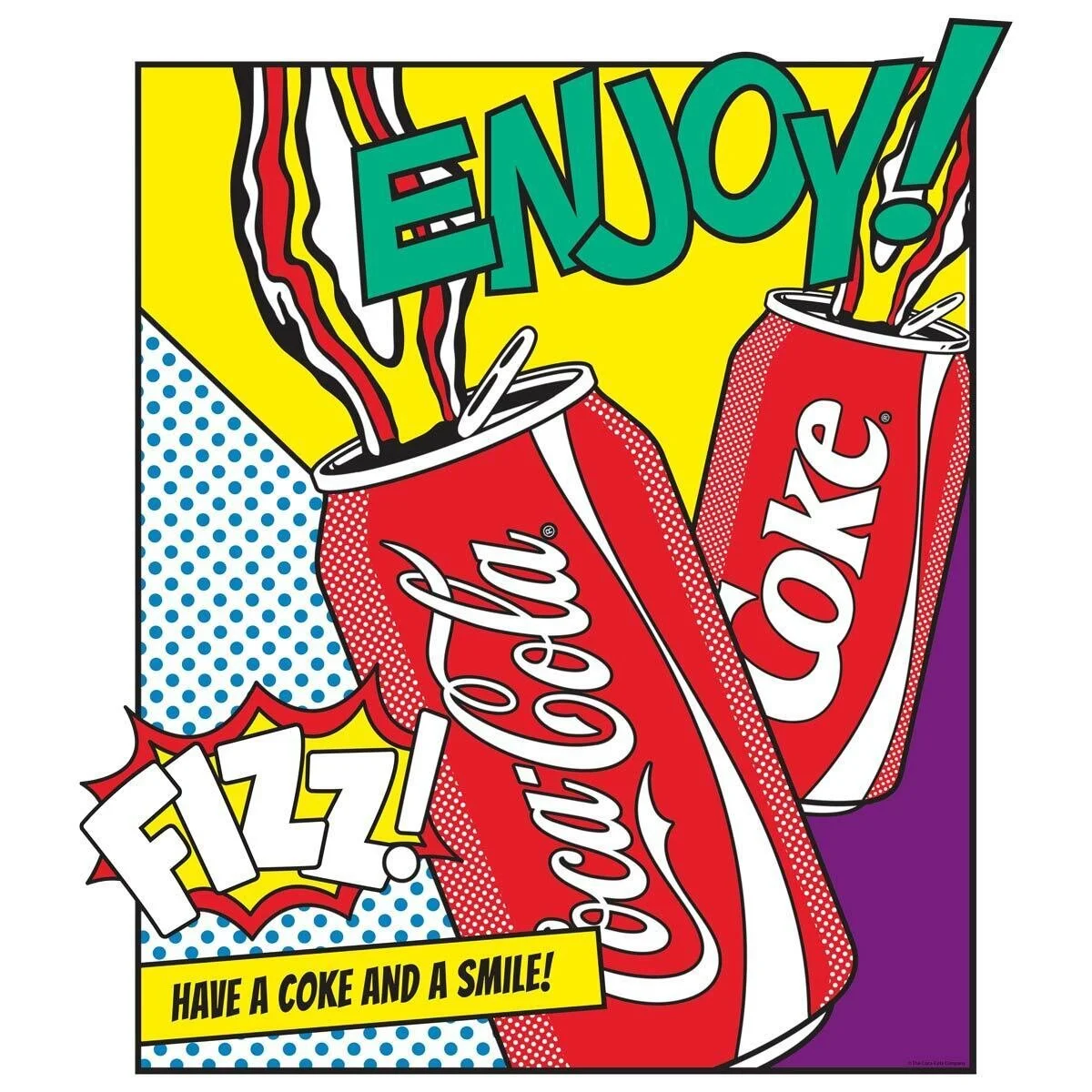
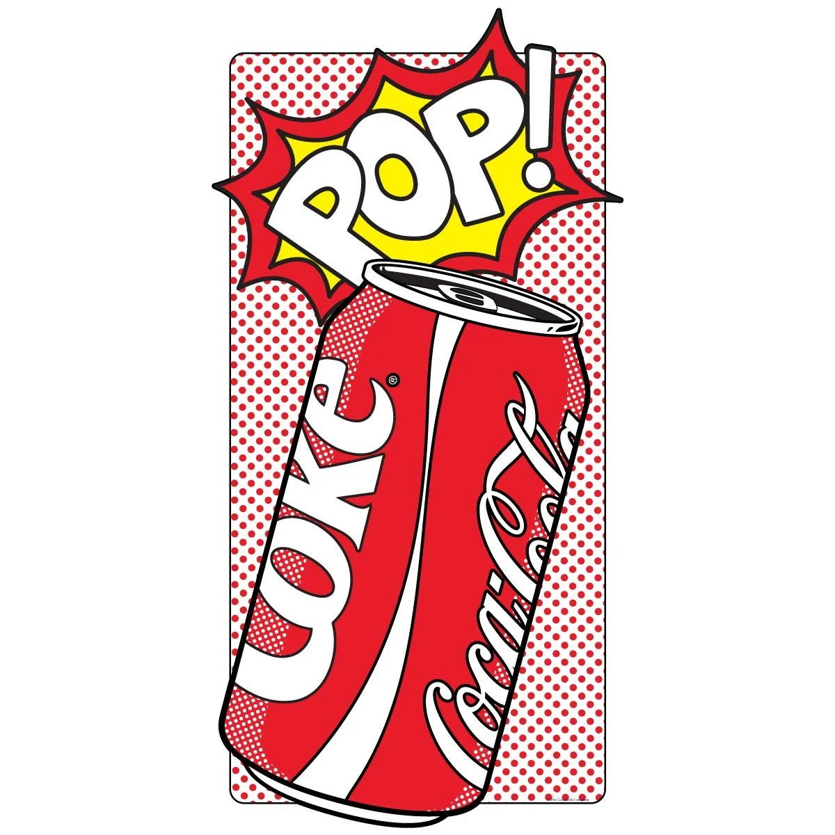
Pop art:
Artists, through the medium of pop art, freely transform their ideas into reality, unencumbered by the constraints of traditional art rules. This aligns with the essence of Pepsi's new slogan, which embodies the confidence and pride of Pepsi consumers in their lifestyle. Moreover, pop art primarily focuses on popular and mass culture, reflecting cola's positioning as a quintessential mass-market product.
设计风格:
波普艺术:
艺术家借助波普艺术,自由地将他们的想法转化为现实,不受传统艺术规则的阻碍。 这与百事可乐新口号的精髓相一致,即百事可乐用户充满自信,自豪生活的态度。 此外,波普艺术主要关注流行和大众文化,反映了可乐作为典型大众产品的定位。