Webpage Design
网页设计
Tools: Visual studio code, Code pen, Adobe after effects
Final video
Web Page design
Basic layout web
-
<html lang="en">
<head>
<meta charset="UTF-8">
<meta name="viewport" content="width=device-width, initial-scale=1.0">
<link rel="stylesheet" href="styles.css">
<link href="https://fonts.googleapis.com/css2?family=Orbitron&display=swap" rel="stylesheet">
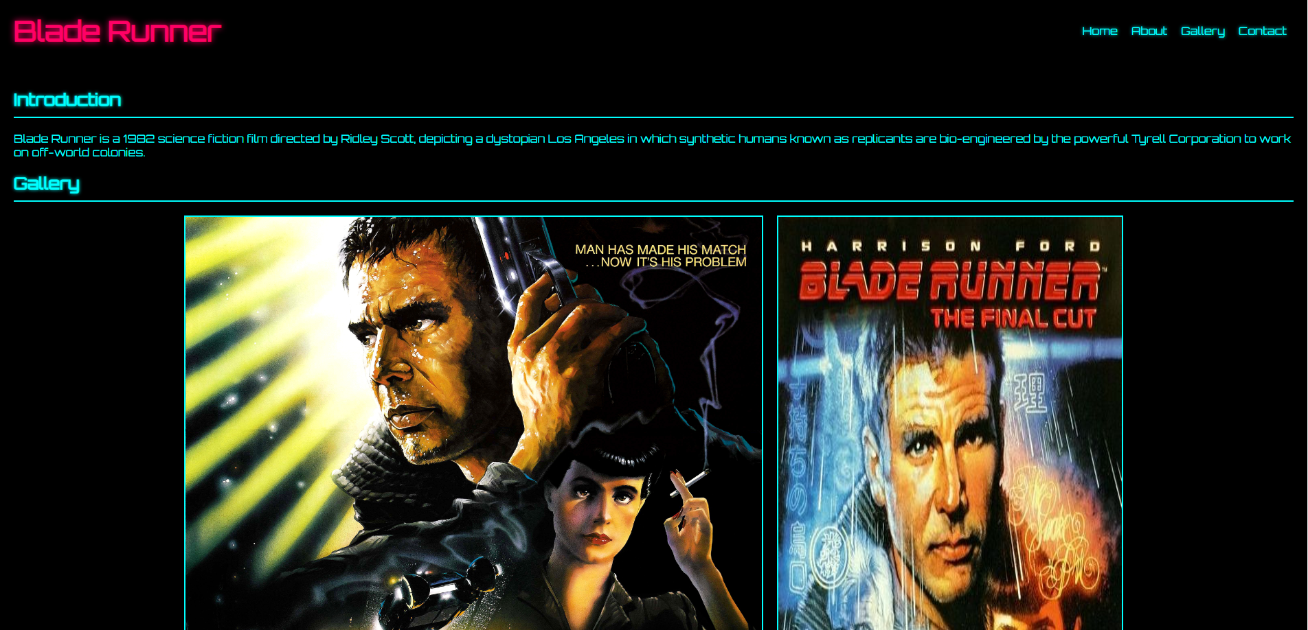
<title>Blade Runner Movie Introduction</title>
</head>
<body>
<header>
<h1>Blade Runner</h1>
<nav>
<ul>
<li>Home</li>
<li>About</li>
<li>Gallery</li>
<li>Contact</li>
</ul>
</nav>
</header>
<main>
<section class="intro">
<h2>Introduction</h2>
<p>Blade Runner is a 1982 science fiction film directed by Ridley Scott, depicting a dystopian Los Angeles in which synthetic humans known as replicants are bio-engineered by the powerful Tyrell Corporation to work on off-world colonies.</p>
</section>
<section class="gallery">
<h2>Gallery</h2>
<div class="gallery-content">
<img src=https://m.media-amazon.com/images/M/MV5BNzQzMzJhZTEtOWM4NS00MTdhLTg0YjgtMjM4MDRkZjUwZDBlXkEyXkFqcGdeQXVyNjU0OTQ0OTY@._V1_.jpgalt="Blade Runner Image 1" />
<img src=https://deepfocusreview.com/wp-content/uploads/2016/12/blade_runner.jpg alt="Blade Runner Image 2" />
</div>
</section>
</main>
<footer>
<p>© 2023 Blade Runner Movie Introduction</p>
</footer>
</body>
</html>
-
body {
margin: 0;
font-family: 'Orbitron', sans-serif;
background-color: #000;
color: #0ff;
background-image: url('path_to_your_cyberpunk_background.jpg'), repeating-linear-gradient(0deg, transparent, transparent 95%, rgba(255,255,255,0.1) 98%);
background-size: cover, 100% 25px;
background-repeat: no-repeat;
animation: scanlines 5s infinite alternate;
}
@keyframes scanlines {
0% {
background-position: 0 0, 0 0;
}
100% {
background-position: 0 100%, 0 25px;
}
}
header {
display: flex;
justify-content: space-between;
align-items: center;
padding: 20px;
background-color: rgba(0, 0, 0, 0.7);
}
header h1 {
margin: 0;
font-size: 2.5em;
text-shadow: 0 0 10px #f06;
color: #f06; /* Different neon color for the title */
}
nav ul {
list-style-type: none;
margin: 0;
padding: 0;
display: flex;
}
nav li {
margin: 0 10px;
text-shadow: 0 0 5px #0ff;
}
main {
padding: 20px;
background-color: rgba(0, 0, 0, 0.7);
}
section {
margin-bottom: 20px;
}
h2 {
border-bottom: 2px solid #0ff;
padding-bottom: 10px;
font-size: 1.5em;
text-shadow: 0 0 5px #0ff;
}
p {
font-size: 1em;
}
.gallery-content {
display: flex;
gap: 20px;
justify-content: center;
flex-wrap: wrap;
}
.gallery-content img {
max-width: 45%;
height: auto;
border: 2px solid #0ff;
}
footer {
text-align: center;
padding: 10px;
background-color: rgba(0, 0, 0, 0.7);
}
footer p {
text-shadow: 0 0 5px #0ff;
}
Css animation
-
<html lang="en">
<head>
<meta charset="UTF-8">
<meta name="viewport" content="width=device-width, initial-scale=1.0">
<link rel="stylesheet" href="style.css">
<link rel="preconnect" href="https://fonts.googleapis.com">
<link rel="preconnect" href="https://fonts.gstatic.com" crossorigin>
<link href="https://fonts.googleapis.com/css2?family=Poppins:ital,wght@1,800&display=swap" rel="stylesheet">
</head>
<body>
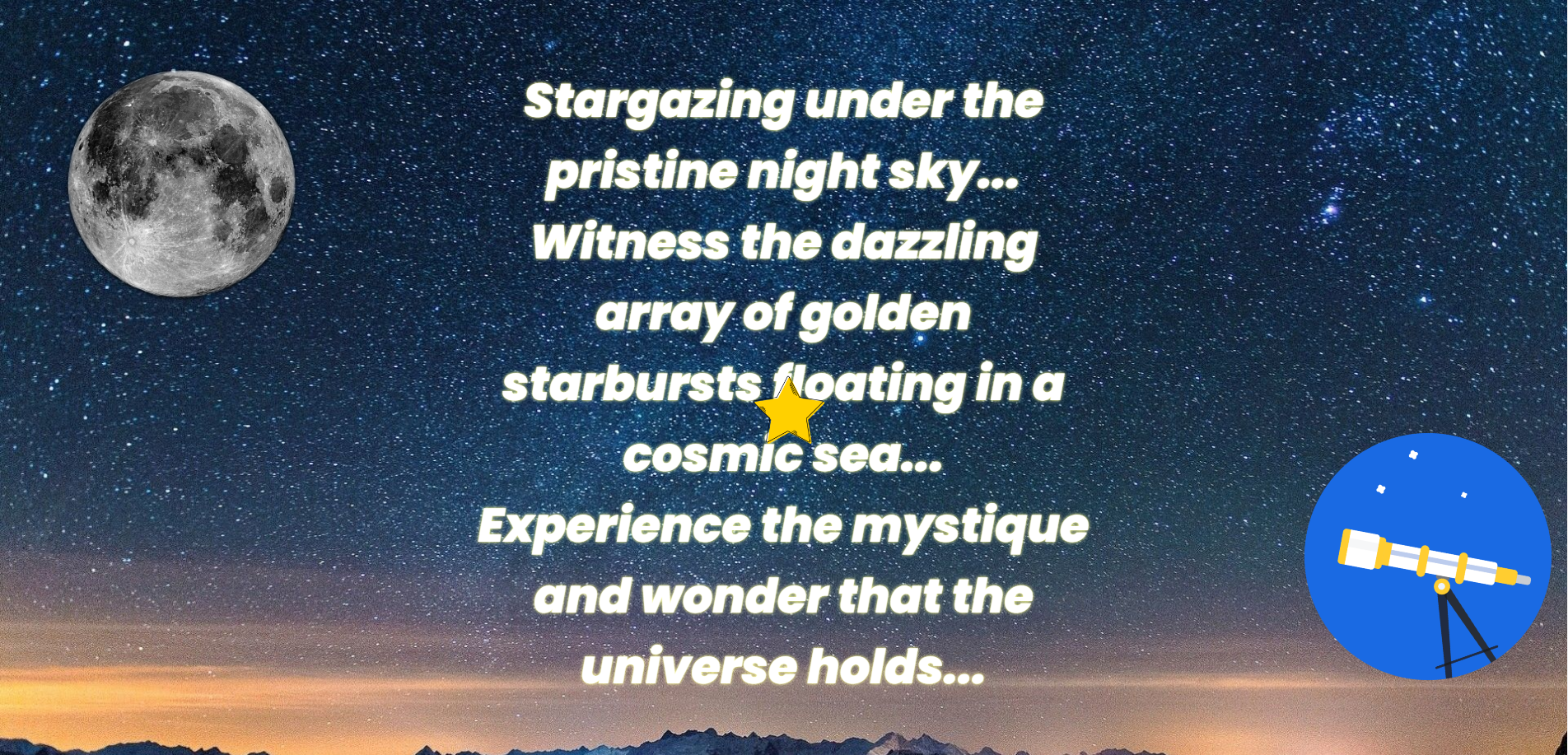
<img src="https://purepng.com/public/uploads/large/purepng.com-moonmoonastronomical-bodyfifth-largest-natural-satellitenatural-satellitemoon-light-1411527067328btskq.png" width="400px" class="moon">
<img src="https://upload.wikimedia.org/wikipedia/commons/thumb/6/6f/Lingua_libre_illustration_-_telescope.svg/2048px-Lingua_libre_illustration_-_telescope.svg.png" width="300px" class="telescope">
<img src="https://png.pngtree.com/png-clipart/20230414/ourmid/pngtree-star-clipart-png-image_6705223.png" width="100px" class="star">
<div id="wrapper">
<p class="stargazing-text animated glow">Stargazing under the pristine night sky...<br>
Witness the dazzling array of golden starbursts floating in a cosmic sea...<br>
Experience the mystique and wonder that the universe holds...</p>
</div>
<div class="fixed-div">
<marquee behavior="scroll" direction="left">Join us for a night under the stars...</marquee>
</div>
</body>
</html>
-
body {
background-image: url('https://wallpaper-house.com/data/out/12/wallpaper2you_533986.jpg');
background-size: cover;
background-attachment: fixed;
overflow: auto;
}
#wrapper {
width: 750px;
margin: 120px auto;
text-align: center;
}
.stargazing-text {
color: white;
font-family: "Poppins", sans-serif;
font-size: 3vw;
font-weight: 800;
}
.glow {
text-shadow: 0 0 5px #FFFF99, 0 0 2px #FFFF99;
}
.moon {
position: fixed;
top: 10%;
left: 1%;
animation-name: up-n-down;
animation-duration: 10s;
animation-iteration-count: infinite;
animation-direction: alternate;
z-index: 2;
}
.telescope {
position: fixed;
bottom: 10%;
right: 1%;
animation-name: g-animate;
animation-duration: 20s;
animation-iteration-count: infinite;
z-index: 3;
}
.star {
position: fixed;
top: 20%;
left: 50%;
animation-name: move;
animation-duration: 6s;
animation-iteration-count: infinite;
z-index: 1;
}
.fixed-div {
position: fixed;
bottom: 0;
width: 300%;
color: white;
text-align: center;
}
.animated {
animation-duration: 1s;
animation-fill-mode: both;
animation-iteration-count: infinite;
opacity: 1;
}
.animated:hover {
cursor: pointer;
}
@keyframes g-animate {
0% {
transform: rotate(0deg);
}
100% {
transform: rotate(360deg);
}
}
@keyframes up-n-down {
0% {
transform: translateY(0);
}
100% {
transform: translateY(-30px);
}
}
@keyframes move {
0% {
top: 20%;
left: -10%;
transform: scale(0.5);
}
50% {
top: 50%;
left: 50%;
transform: scale(1);
}
100% {
top: 20%;
left: 110%;
transform: scale(0.5);
}
}
YouTube BG + Draggable Element
-
<html lang="en">
<head>
<meta charset="UTF-8">
<meta name="viewport" content="width=device-width, initial-scale=1.0">
<title>Draggable Logo & Marquee</title>
<link rel="stylesheet" href="styles.css">
<script src="https://code.jquery.com/jquery-3.6.0.min.js"></script>
<script src="https://code.jquery.com/ui/1.12.1/jquery-ui.min.js"></script>
<script src="https://cdnjs.cloudflare.com/ajax/libs/gsap/3.9.1/gsap.min.js"></script>
<script src="https://cdnjs.cloudflare.com/ajax/libs/gsap/3.9.1/Draggable.min.js"></script>
</head>
<body>
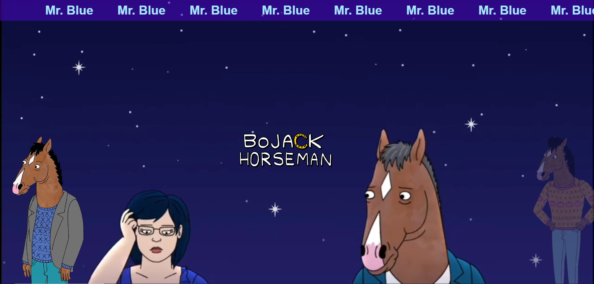
<div class="wrap">
<div class="video-bg">
<iframe src="https://www.youtube.com/embed/hIf9Xd9_eTA?controls=0&autoplay=1&loop=1&mute=1&playlist=hIf9Xd9_eTA" frameborder="0" allowfullscreen></iframe>
</div>
<div class="star shine-move" style="top: 20%; left: 12%;"></div>
<div class="star shine-move" style="top: 40%; left: 78%;"></div>
<div class="star shine-move" style="top: 70%; left: 45%;"></div>
<div class="star flying-star"></div>
<div class="character1"></div>
<div class="character2"></div>
<div class="draggable resizable"></div>
<div class="draggable">
<img src="https://upload.wikimedia.org/wikipedia/commons/c/cc/BoJack_Horseman_Logo.svg" alt="BoJack Horseman Logo" class="logo">
</div>
<marquee class="marquee-text" behavior="scroll" direction="left" scrollamount="5">Mr. Blue Mr. Blue Mr. Blue Mr. Blue Mr. Blue Mr. Blue Mr. Blue Mr. Blue </marquee>
</div>
<script src="script.js"></script>
</body>
</html>
-
html, body {
margin: 0;
padding: 0;
font-family: 'Arial', sans-serif;
overflow: hidden;
}
.wrap {
position: relative;
height: 100vh;
}
.video-bg {
position: relative;
height: 100%;
background: #000;
overflow: hidden;
}
.video-bg iframe {
display: block;
position: absolute;
top: 50%;
left: 50%;
transform: translate(-50%, -50%);
width: 100vw;
height: 60vw;
}
.draggable {
max-width: 500px;
max-height: 450px;
position: absolute;
background: transparent;
top: 0;
left: 0;
cursor: grab !important;
}
.logo {
width: 60%;
height: auto;
display: block;
}
.marquee-text {
font-size: 40px;
font-weight: bold;
background-color: rgba(82, 4, 208, 0.5);
color: #A6E7FC;
padding: 10px;
opacity: 1;
width: 100%;
position: absolute;
top: 0;
left: 0;
z-index: 10;
white-space: nowrap;
overflow: hidden;
line-height: 1.2;
}
.character1, .character2 {
position: absolute;
width: 500px;
opacity: 0.3;
z-index: 9999;
transition: opacity 0.3s;
}
.character1:hover, .character2:hover {
opacity: 1;
}
.character1 {
top: 47%;
left: -5%;
background-image: url('https://i.imgur.com/UpSMp5y.png');
background-size: cover;
height: 500px;
}
.character2 {
top: 47%;
right: -8%;
background-image: url('https://i.imgur.com/gZrRBAl.png');
background-size: cover;
height: 500px;
}
.star {
position: absolute;
width: 50px;
height: 50px;
background: url('https://www.seekpng.com/png/full/5-51325_shining-star-vector-png.png') no-repeat;
background-size: cover;
opacity: 0.5;
}
.shine-move {
animation: shine 1.5s infinite, move 1s infinite;
}
@keyframes shine {
0% { opacity: 0.3; }
50% { opacity: 1; }
100% { opacity: 0.3; }
}
@keyframes move {
0% { transform: translateY(0); }
50% { transform: translateY(10px); }
100% { transform: translateY(0); }
}
.flying-star {
top: 10%;
left: 50%;
animation: fly 30s infinite;
}
@keyframes fly {
0% { top: 10%; left: 50%; }
25% { top: 90%; left: 10%; }
50% { top: 10%; left: 10%; }
75% { top: 90%; left: 90%; }
100% { top: 10%; left: 50%; }
}
-
$(document).ready(function() {
$('.resizable').resizable();
$('.ui-resizable-handle').attr('data-clickable', true);
Draggable.create('.draggable');
});

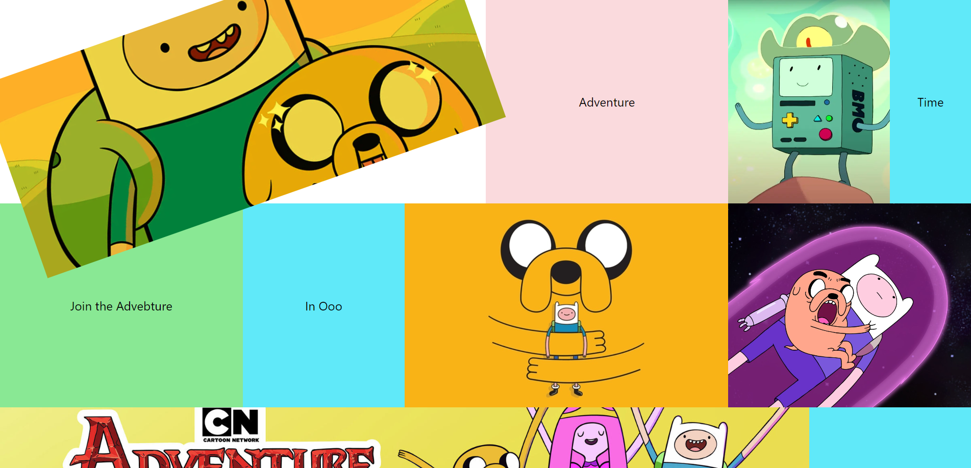
Bootstrap
-
<head>
<link href="https://cdn.jsdelivr.net/npm/bootstrap@latest/dist/css/bootstrap.min.css" rel="stylesheet">
<script src="https://cdn.jsdelivr.net/npm/bootstrap@latest/dist/js/bootstrap.bundle.min.js"></script>
</head>
<body>
<div class="container-fluid text-center">
<div class="row">
<div class="col-md-6 orange hover" id="block1"></div>
<div class="col-lg-3 bar-block" id="barBlock1">Adventure</div>
<div class="col-md-2 blue hover" id="block2"></div>
<div class="col-lg-1 small-block" id="smallBlock1">Time</div>
</div>
<div class="row">
<div class="col-lg-3 text-block" id="textBlock1">Join the Advebture</div>
<div class="col-lg-2 bar-block" id="barBlock2">In Ooo</div>
<div class="col-lg-4 green hover" id="block4"></div>
<div class="col-lg-3 purple hover" id="block5"></div>
</div>
<div class="row">
<div class="col-lg-10 orange hover" id="block6"></div>
<div class="col-lg-2 small-block" id="smallBlock2">Explore</div>
</div>
<div class="row">
<div class="col-lg-4 bar-block" id="barBlock3">Discover</div>
<div class="col-lg-2 blue hover" id="block7"></div>
<div class="col-lg-4 purple hover" id="block8"></div>
<div class="col-lg-2 bar-block" id="barBlock4">New Worlds</div>
</div>
</div>
</body>
</html>
-
body {
background: #e2e0bd;
font-family: 'Fredoka One', Arial, sans-serif;
}
div {
min-height: 500px;
}
.col {
padding: 0;
}
.hover:hover {
transform: rotate(-20deg);
transition: 1s;
}
#block1, #block2, #block4, #block5, #block6, #block7, #block8 {
background-position: center;
background-repeat: no-repeat;
background-size: cover;
transition: background-blend-mode 0.3s ease, transform 0.3s ease;
}
#block1 {
background: url('https://www.studiosity.com/hubfs/DTC/09.blog/AdventureTime_characters.jpg') no-repeat center center, #FFF44F;
background-size: cover;
}
#block1:hover {
background-blend-mode: multiply;
}
#block2 {
background: url('https://decider.com/wp-content/uploads/2020/06/adventure-time-distant-lands-bmo.jpg?quality=75&strip=all') no-repeat center center, #89E894;
background-size: cover;
}
#block2:hover {
background-blend-mode: screen;
}
#block4 {
background: url('https://dafb3cv85j5xj.cloudfront.net/blog/wp-content/uploads/2016/05/Mybestfriend.jpg') no-repeat center center, #89E894;
background-size: cover;
}
#block4:hover {
background-blend-mode: overlay;
}
#block5 {
background: url('https://cdn.vox-cdn.com/thumbor/xfAzeIfafu0RSMJ5INGC9gIUEnU=/1400x1400/filters:format(jpeg)/cdn.vox-cdn.com/uploads/chorus_asset/file/12761347/Adventure_Time_Episode_282_Still.jpg') no-repeat center center, #FFF44F;
background-size: cover;
}
#block5:hover {
background-blend-mode: lighten;
}
#block6 {
background: url('https://images-na.ssl-images-amazon.com/images/S/pv-target-images/4c9e7d9453b9871f3ec7f88679f966d79512da36b6ec76e5d7a656aaf0420fdf._RI_TTW_.jpg') no-repeat center center, #FFF44F;
background-size: cover;
}
#block6:hover {
background-blend-mode: darken;
}
#block7 {
background: url('https://cdn.costumewall.com/wp-content/uploads/2016/10/princess-bubblegum-costume.jpg') no-repeat center center, #FFF44F;
background-size: cover;
}
#block7:hover {
background-blend-mode: color-dodge;
}
#block8 {
background: url('https://i.pinimg.com/564x/dd/21/56/dd2156b678ee439f514673968fc55c33.jpg') no-repeat center center, #FFF44F;
background-size: cover;
}
#block8:hover {
background-blend-mode: color-burn;
}
.bar-block, .small-block, #textBlock1 {
display: flex;
align-items: center;
justify-content: center;
font-size: 30px;
color: black;
}
#barBlock1 {
background-color: #FADADD;
}
#barBlock2 {
background-color: #60E9F9;
}
#barBlock3 {
background-color: #FADADD;
}
#barBlock4 {
background-color: #FADADD;
}
#smallBlock1 {
background-color: #60E9F9;
}
#smallBlock2 {
background-color: #60E9F9;
}
#textBlock1 {
background-color: #89E894;
}
@media (max-width: 768px) {
.hover:hover {
transform: none;
}
.bar-block, .small-block, #textBlock1 {
font-size: 30px;
}
}
Marquee + Fixed Div + Hover (bonus)
-
<body>
<div class="fixed-div">
<div class="column">
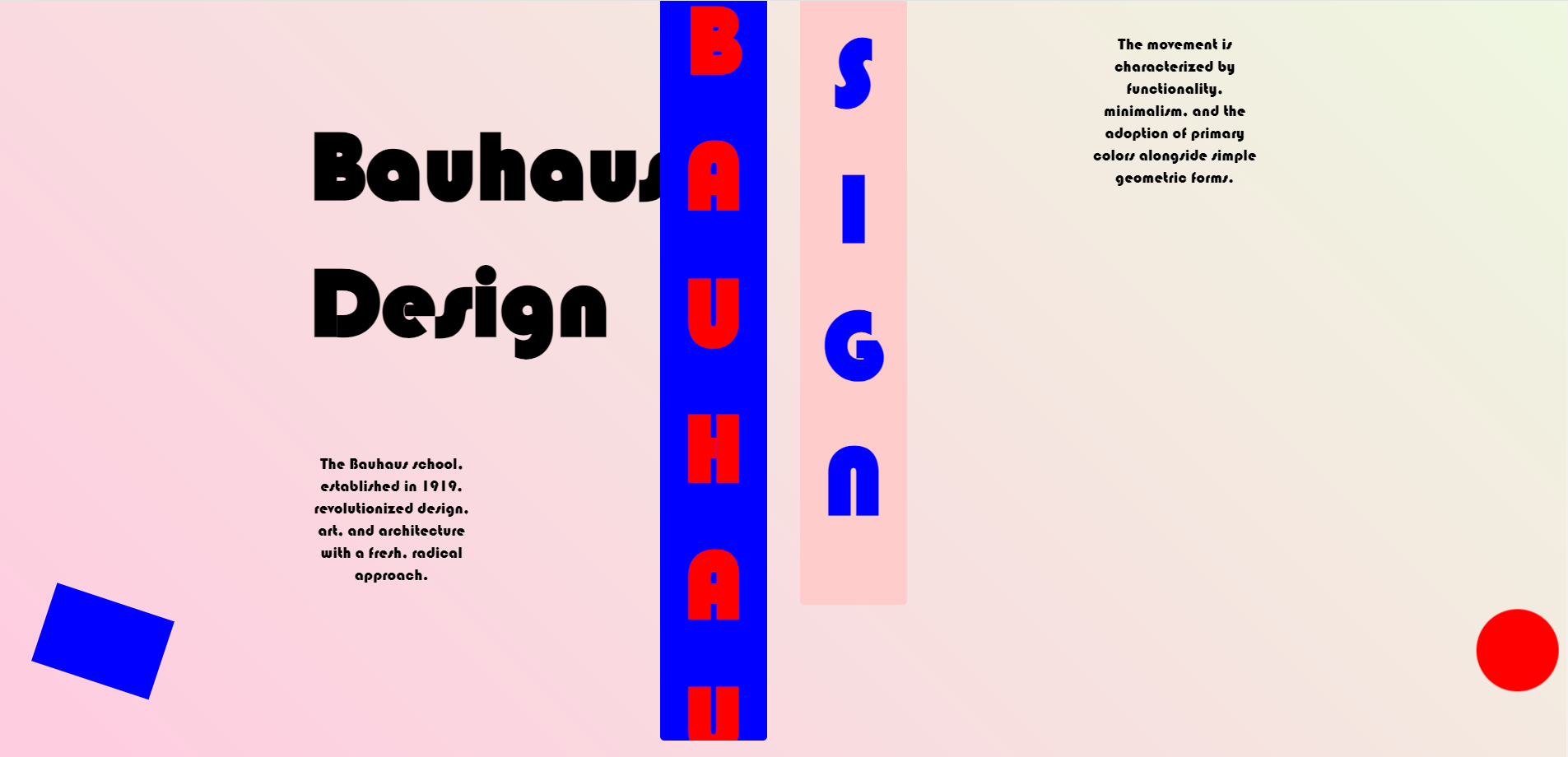
<h2>Bauhaus Design</h2>
<p>The Bauhaus school, established in 1919, revolutionized design, art, and architecture with a fresh, radical approach.</p>
</div>
<div class="column">
<p>The movement is characterized by functionality, minimalism, and the adoption of primary colors alongside simple geometric forms.</p>
</div>
</div>
<div class="marquee-container">
<marquee direction="up" class="bg_blue marquee-hover">
<h1 class="red">B<br>A<br>U<br>H<br>A<br>U<br>S</h1>
</marquee>
<marquee direction="down" class="bg_red marquee-hover">
<h1 class="blue">D<br>E<br>S<br>I<br>G<br>N</h1>
</marquee>
</div>
<div class="circle-shape"></div>
<div class="rectangle-shape"></div>
</body>
-
@keyframes circle-motion {
0% {
transform: translateX(0) translateY(0);
}
50% {
transform: translateX(100px) translateY(50px);
}
100% {
transform: translateX(0) translateY(0);
}
}
@keyframes rectangle-motion {
0% {
transform: translateY(0) rotate(0deg);
}
50% {
transform: translateY(-100px) rotate(45deg);
}
100% {
transform: translateY(0) rotate(0deg);
}
}
body {
margin: 0px;
display: flex;
flex-direction: column;
align-items: center;
background: linear-gradient(45deg, #f06, #9f6);
font-family: 'Bauhaus 93', sans-serif;
position: relative;
min-height: 100vh;
}
.fixed-div {
position: fixed;
top: 0;
width: 100%;
min-height: 100vh;
background: rgba(255, 255, 255, 0.8);
padding: 20px;
box-shadow: 0 4px 6px rgba(0, 0, 0, 0.1);
display: flex;
justify-content: space-around;
text-align: center;
transition: transform 0.3s;
}
.fixed-div:hover {
transform: translateY(-10px);
box-shadow: 0 8px 12px rgba(0, 0, 0, 0.1);
}
.column {
max-width: 200px;
transition: transform 0.3s;
}
.column:hover {
transform: scale(1.05);
}
.marquee-container {
display: flex;
justify-content: center;
margin-top: 100px;
}
marquee {
height: 100%;
width: 130px;
margin: 20px;
border-radius: 5px;
}
h1, h2 {
text-align: center;
font-size: 13vh;
line-height: 18vh;
}
p {
font-size: 1.2em;
}
.bg_blue {
background: blue;
}
.bg_red {
background: red;
}
.red {
color: red;
}
.blue {
color: blue;
}
.marquee-hover:hover {
filter: brightness(1.2);
}
.circle-shape {
position: absolute;
bottom: 100px;
right: 50px;
width: 100px;
height: 100px;
background-color: red;
border-radius: 50%;
animation: circle-motion 5s infinite linear;
}
.rectangle-shape {
position: absolute;
bottom: 50px;
left: 50px;
width: 150px;
height: 100px;
background-color: blue;
animation: rectangle-motion 5s infinite linear;
}
Background Blend Mode + Clip Path + Hover
-
<html lang="en">
<head>
<meta charset="UTF-8">
<meta name="viewport" content="width=device-width, initial-scale=1.0">
<link rel="preconnect" href="https://fonts.googleapis.com">
<link rel="preconnect" href="https://fonts.gstatic.com" crossorigin>
<link href="https://fonts.googleapis.com/css2?family=Oswald:wght@200;500&family=Playfair+Display&display=swap" rel="stylesheet">
<link rel="stylesheet" href="cranberries-unique.css">
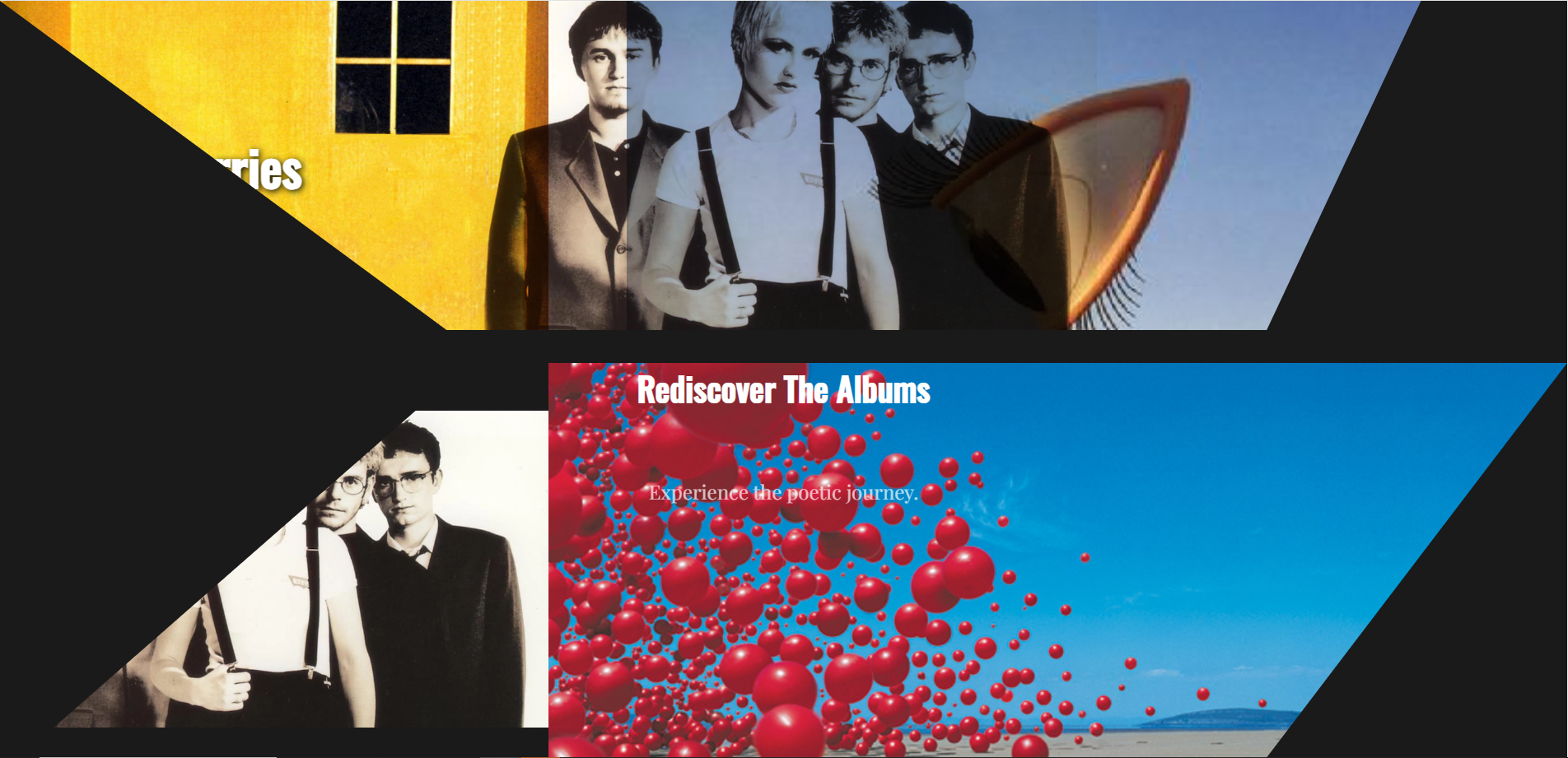
<title>The Cranberries Unique Design</title>
</head>
<body>
<div id="header">
<h1>The Cranberries</h1>
</div>
<div id="album-info">
<h2>Rediscover The Albums</h2>
<div id="description">
<p>Experience the poetic journey.</p>
</div>
</div>
</body>
</html>
-
body {
font-family: 'Oswald', sans-serif;
background-color: #1a1a1a;
color: white;
margin: 0;
padding: 0;
overflow-x: hidden;
}
#header {
background:
url('https://f4.bcbits.com/img/a1185428168_10.jpg') left/35% no-repeat,
url('https://www.musik-sammler.de/cover/1175500/1175117_1453985885.jpg') right/60% no-repeat,
url('https://consequence.net/wp-content/uploads/2018/03/the-cranberries-final-album-dolores-25th-anniversar-debut.png') center/40% no-repeat;
height: 400px;
background-blend-mode: screen;
clip-path: polygon(0 0, 60% 0, 100% 100%, 40% 100%);
transition: background-blend-mode 0.5s, clip-path 0.5s;
}
#header h1 {
font-size: 60px;
margin: 0;
position: relative;
top: 50%;
left: 50%;
transform: translate(-50%, -50%);
text-shadow: 2px 2px 8px #000;
}
#header:hover {
background-blend-mode: multiply;
clip-path: polygon(0% 0%, 100% 0%, 75% 100%, 25% 100%);
}
#album-info {
background:
url('https://consequence.net/wp-content/uploads/2018/03/the-cranberries-final-album-dolores-25th-anniversar-debut.png') left/35% no-repeat,
url('https://sfae.blob.core.windows.net/media/ecommercesite/media/sfae/sfae.artwork/1859_1.jpg') right/65% no-repeat;
background-blend-mode: exclusion;
clip-path: polygon(30% 0, 100% 0, 80% 100%, 0% 100%);
min-height: 500px;
transition: background-blend-mode 0.5s, clip-path 0.5s;
}
#album-info:hover {
background-blend-mode: screen;
clip-path: polygon(15% 0%, 85% 0%, 70% 100%, 30% 100%);
}
h2 {
font-size: 40px;
text-align: center;
margin-top: 40px;
transition: color 0.5s, text-shadow 0.5s;
}
h2:hover {
color: #ab4e0f;
text-shadow: 2px 2px 6px #fff;
}
#description {
margin: 40px;
clip-path: circle(40% at 50% 50%);
transition: clip-path 0.5s ease;
}
#description:hover {
clip-path: circle(60% at 50% 50%);
}
p {
font-family: 'Playfair Display', serif;
font-size: 24px;
text-align: center;
padding: 40px;
opacity: 0.7;
transition: opacity 0.5s ease;
}
p:hover {
opacity: 1;
}

Squeezing / expanding a viewport
-
<head>
<meta charset="UTF-8">
<meta name="viewport" content="width=device-width, initial-scale=1.0">
<title>Banana Ripening</title>
<link rel="stylesheet" href="styles.css">
</head>
<body>
<div id="wrapper">
<div class="banana-stage" id="green-banana">
<img src="https://i.imgur.com/jhH66cZ.jpg" alt="Green Banana">
<p><span>A green</span><span>banana, not</span><span>quite ripe</span><span>yet.</span></p>
</div>
<div class="banana-stage" id="yellow-banana">
<img src="https://i.imgur.com/glYTyq6.png" alt="Yellow Banana">
<p><span>A perfect</span><span>yellow</span><span>banana,</span><span>ready to eat.</span></p>
</div>
<div class="banana-stage" id="speckled-banana">
<img src="https://i.imgur.com/JYLjtDN.png" alt="Speckled Banana">
<p><span>A speckled</span><span>banana with</span><span>the marks of</span><span>time.</span></p>
</div>
<div class="banana-stage" id="overripe-banana">
<img src="https://i.imgur.com/dunp7l8.png" alt="Overripe Banana">
<p><span>An overripe</span><span>banana,</span><span>darkened</span><span>with age.</span></p>
</div>
</div>
</body>
</html>
-
body {
font-family: 'Inter', sans-serif;
background-color: #f4f5f7;
margin: 0;
padding: 0;
color: #333;
}
#wrapper {
max-width: 1200px;
width: 90%;
margin: 40px auto;
padding: 20px;
background: #ffffff;
box-shadow: 0 4px 12px rgba(0, 0, 0, 0.1);
border-radius: 8px;
}
.banana-stage {
position: relative;
display: none;
padding: 20px 0;
}
.banana-stage img {
width: 100%;
max-width: 600px;
margin: 20px auto;
display: block;
border-radius: 4px;
box-shadow: 0 4px 8px rgba(0, 0, 0, 0.08);
}
.banana-stage p {
font-size: 40px;
position: absolute;
top: 10px;
left: 10px;
margin: 0;
background-color: rgba(255, 255, 255, 0.8);
padding: 5px 10px;
border-radius: 4px;
}
.banana-stage p span {
display: block;
}
#overripe-banana {
display: block;
}
@media only screen and (min-width: 401px) and (max-width: 600px) {
#overripe-banana {
display: none;
}
#speckled-banana {
display: block;
}
}
@media only screen and (min-width: 601px) and (max-width: 900px) {
#overripe-banana, #speckled-banana {
display: none;
}
#yellow-banana {
display: block;
}
}
@media only screen and (min-width: 901px) {
#overripe-banana, #speckled-banana, #yellow-banana {
display: none;
}
#green-banana {
display: block;
}
}
p5js techniques
-
<!DOCTYPE html>
<html lang="en">
<head>
<meta charset="UTF-8">
<meta name="viewport" content="width=device-width, initial-scale=1.0">
<title>Week 8 Project</title>
<link rel="stylesheet" href="css/styles.css">
<script src="js/p5.min.js"></script>
<script src="js/script.js" defer></script>
</head>
<body>
</body>
</html>
-
* {
background-color: black;
margin: 0;
padding: 0;
}
body {
overflow: hidden;
}
#hello {
color: blue;
font-size: 1000px;
font-family: 'Franklin Gothic Medium', 'Arial Narrow', Arial, sans-serif;
}
-
let images = [];
let customCursor;
let drawing = false;
let counter = 0;
function preload() {
// Load all images
for (let i = 1; i <= 5; i++) {
images.push(loadImage(i + ".png"));
}
customCursor = loadImage('3.png');
}
function setup() {
createCanvas(windowWidth, windowHeight);
cursor('none');
imageMode(CENTER);
frameRate(20);
}
function draw() {
// Increment counter
counter++;
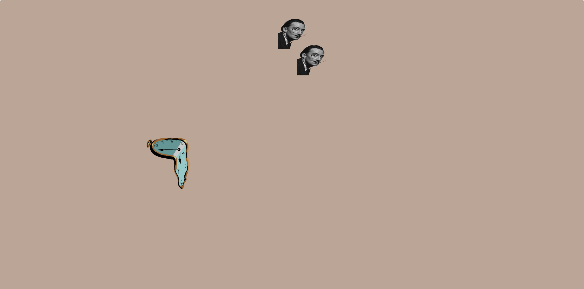
// Surreal colors like Dali's paintings
if (!drawing && counter % 8 == 0) {
let r = map(mouseX, 0, width, 150, 220);
let g = map(mouseY, 0, height, 150, 220);
background(r, g, 150);
// Randomly select one of the images to display
let img = random(images);
img = posterizeImage(img);
image(img, random(width), random(height), 200, 200);
}
// If the mouse is pressed, draw with the custom cursor
if (mouseIsPressed) {
image(customCursor, mouseX, mouseY, 100, 100);
drawing = true;
} else {
drawing = false;
}
// Display the custom cursor at the mouse position
image(customCursor, mouseX, mouseY, 100, 100);
}
function posterizeImage(img) {
img.loadPixels();
for (let i = 0; i < img.pixels.length; i+=4) {
img.pixels[i] = floor(img.pixels[i] / 50) * 50;
img.pixels[i+1] = floor(img.pixels[i+1] / 50) * 50;
img.pixels[i+2] = floor(img.pixels[i+2] / 50) * 50;
}
img.updatePixels();
return img;
}